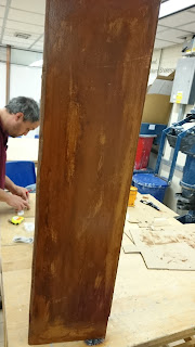
For the construction of my cabinet i would have liked to have used a hard wood such as oak or mahogany, due to financial reasons i could not afford this. It would have been an ideal thickness and the colouration would have been perfect for the aged look i was trying to achieve. The only wood i could source for free or a relatively low price was MDF board provided by the college, although easy to work with and cut it would not have been my first choice of wood if money wasn't an issue. MDF is not as hard as solid wood and can often split, in my work i fixed the splits using wood glue.
Health and Safety associated with woodwork:
Be cautious of wood dust, always work in well ventilated areas and use goggles and dust masks if needed.
Remove wood dust from the floors as it reduces the grip between shoes and the floor resulting in a trip hazard.
Take care when using power tools such as a band saw and belt sander.
When cutting would by hand ensure wood is secured and stable so that you do not slip and cut yourself.
Hold hammer at safe distance from face and fingers when hammering nails.
Technical Notes
Sunday, 14 June 2015
Tuesday, 9 June 2015
Cabinet Making
The whole cabinet was made from a singular board of MDF, this was cut down using the band saw. The cabinet consisted of 2 sides, 5 shelves including the top and bottom, a back board made from plywood, 2 drawers and a divider between them.
The above images show early construction of the basic cabinet framing, it is all held together using nails and wood glue.
The wooden struts were included to hold the cabinet in position whilst the glue dried, this ensured the cabinet would stay straight and rectangular.
The plywood backing was cut to size and attached using nails.
The drawers were made from 4 sides of MDF cut to size with a plywood bottom. The sides were adhered using nails and glue just like the framing, the bottom was attached with the use of nails. The drawers were sanded slightly using a belt sander to tidy them up and straighten the edges.
The sides and shelves of the cabinet were filed and sanded down so that the front edge was rounded off, this was to add to the look of the cabinet.
To colour the MDF board, the cabinet was painted with a mixture of brown paints, wood stain and varnish.
To make an aged wood effect the paint was applied with a sponge instead of a brush, this gave more even covering. A sponge was also used to rub into the MDF removing areas or colour. Sandpaper was also used in areas to rough it up a bit.
Finally the handles were added allowing the drawers to be opened and closed with ease.
completed cabinet!
End of year show, my work
For unit 84 we had to create and evaluate a portfolio of work, the link to my online portfolio is in a separate blog post titled "Flickr". I have also produced a mounted portfolio however many of the pieces are the same, the mounted portfolio was made by mounting the work onto black card and then further mounting this onto A2 white card with double sided tape. Other work was photographed, edited, printed professionally onto glossy paper and then mounted in the same way. My online portfolio was created by photographing my work, digitally editing it and then uploading it. These portfolios would be produced if needed for a job interview or university interview, if the job or university was far away or even abroad then a link to an online portfolio would be sent as it would be quicker and easier for them to get hold off and see. The benefit of having an online portfolio is that it gives you a much wider audience ranging from potential employers to customers. when your work is online there is no limit to how many people can view it, this can often be very useful when looking for jobs and private work. Obviously a mounted portfolio is more time consuming and expensive as materials like the card have to be purchased, it is also quite large and can be an inconvenience to move and take with you. however it is a good and professional way of displaying your work and allows you to talk to the employer or university representatives and provide them with further insight into your artwork. An online portfolio is a lot cheaper and can often cost nothing at all to produce, it does not have to be transported at all and can be accessed with ease, however it is a less personal approach and does not always give you the opportunity to meet your employer/ university representative. I am pleased with both portfolios i have created but i would have to say that i prefer the mounted portfolio as it looks more professional and allows fine detail and texture to be seen as this can easily get lost when on a computer screen. Although large and difficult to transport it offers a much more personal view to your work when you are able to meet your viewer.
For my piece i chose to create a curiosity cabinet base around the creation of my hybrid creature, the Mulgarat. The cabinet contains the Mulgarat, four fetal stages in jars, a deceased frog, a blood sample, a urine sample, an egg and a skull. These are accompanied by a series of detailed anatomical drawings. The exhibition space consisted of two large rooms with tall white MDF boards creating a space in which all the artwork was displayed. There was ample floor space with certain work being presented in the middle on plinths, the lighting illuminated the room well but unfortunately this meant that each piece was lit in the same way. Each board was the same dirty white with scratches and marks left from previous shows, if more time was provided i think many students would have decorated or at least re painted their boards. The audience include staff, students, family members, the general public and visitors to the college, the work had to cater to all and could not be offensive or rude in any way. I chose to display my work on a plinth so that it would be raised up closer to the eye level of the audience, my work was also displayed inside a cabinet, this was to contain all the individual items but also to add to the effect, my illustrations were float mounted above the cabinet. I chose to use the skull as the main focus point and place the other images around this. the presentation within the cabinet was influenced from existing cabinets of curiosities i had found on pinterest and from my own knowledge. My artist statement was placed on the right hand side of my cabinet, this is so it could be clearly seen without taking away from the look of the final piece, the cabinet itself is at the back of the plinth resting against the board, this for health and safety purposes so that it does not get knocked and fall over, all items in the cabinet are placed in the center or at least far enough back to be at a safe distance and still be viewed clearly. As there was a large age group to consider i did not make any parts of the information to elaborate, this allows it to be understood by everyone, the anatomical drawings are also labelled as well as a contents listing each item in the artist statement, this helps to avoid any confusion that might be caused. Staff feedback helped me to reach my final decisions as they recommended what would and wouldn't work in terms of presentation. I wanted to convey a feeling of mystery, curiosity and excitement, i hoped the layout would draw people in and cause them to study my work and try to figure out what it was or where it came from. I also wanted my piece to look aged and antique, the presentation helped greatly with this alongside the discoloration of the labels and treatment of the wood. The show was successful overall however the ratio between 3D and 2D work was very uneven, it would have been nice to see a larger selection of 3D work, i feel if there was a larger time scale this could have been achieved. I think the show could have been made more personal and exciting if each student took the time to elaborate on their piece and show this in the way their boards were decorated or presented. But overall the show was a success and was well executed considering the budget and timescale.
End of year show
As well as our own work, we had to study and review others work also present in the show.
First is the work of Amy Cork, she based her piece around fashion illustration. Acting as her own model she has digitally drawn herself and combined these with coloured backgrounds and digital flowers mounted on foamboard. I like her chosen presentation method however i would like to have seen a few more to fill up the boards. The images are well executed however i think her piece would have aided from a closer colour match on her skin tone.
Next is the work of Sam Terry, he has created responses to music using paint and ink allowing the music to influence his subject matter. A large framed canvas is the center piece with two smaller ink illustrations either side. His piece is abstract with interesting imagery that stands out and the painting technique of dripping down the canvas works very well. The only criticism i would provide is to place the illustrations in the center of the boards.
Exhibition space
The end of year show was held in the North West 2 building in rooms 537 and 532. Below are images showing the spaces in which my work would possibly be displayed.
I chose the last space for my work to be displayed because it seemed the most appropriate, it had a small plinth that would elevate my piece bringing it closer to eye level as well as a singular board behind on which my illustrations would be presented well. The room is spacious with a large light source coming from windows and from lighting. My space is positioned in a corner, this gives my piece more emphasis and attention as it is at a better angle to the viewer when they enter the room than the pieces either side.
Subscribe to:
Posts (Atom)


